Redesigning Japanese Prefecture Logos: A Project by Nina Geometrieva
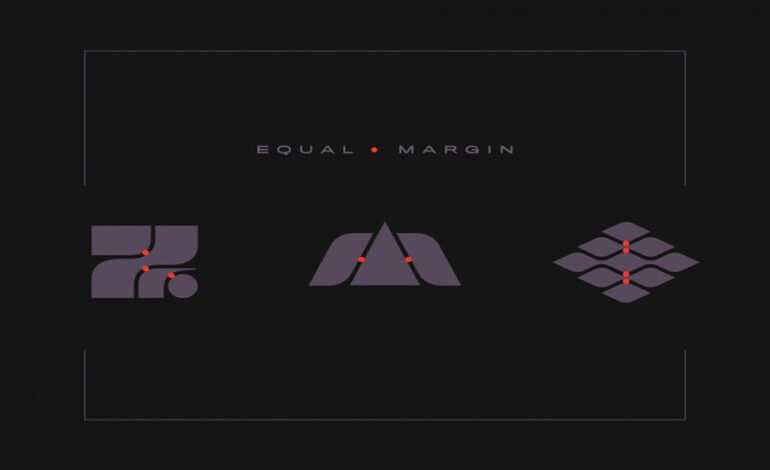
Tokyo-based creative Nina Geometrieva embarked on a self-initiated project to reimagine the logos of Japan’s prefectures, infusing them with fresh new concepts.
Embracing Uniquely Japanese Aesthetics
Geometrieva drew inspiration from her experiences in Japan, capturing the essence of Japanese design in her logo concepts. She noted that the style she observed in Japan resonated with a blend of retro-futurism and nostalgia, along with a touch of corporate sophistication reflected in the geometric elements.

Blending Retro-Futurism and Corporate Aesthetics
The redesigned logos by Geometrieva strike a balance between the retro-futuristic aesthetic and the corporate identity often associated with Japanese prefectures. Through her exploration of cold geometric rendering and sleek design elements, Geometrieva breathed new life into the logos, creating a cohesive visual identity that pays homage to Japan’s rich cultural heritage while embracing modern design sensibilities.
Conclusion: A Fresh Perspective on Japanese Prefecture Logos
In conclusion, Nina Geometrieva’s project to redesign the logos of Japan’s prefectures offers a fresh perspective on traditional design concepts. By infusing her creations with elements of retro-futurism, nostalgia, and corporate aesthetics, Geometrieva has reimagined these logos for the contemporary era, showcasing her creativity and appreciation for Japanese culture.
